My recent experiences as a statistical teacher for epidemiologists or bioinformaticians have brought to my attention important misconceptions of their part about what p-value is and how to use it properly. This is particularly worrisome since significance testing is unavoidable in scientific research. Fortunately or unfortunately, reporting p-values is an important step in research to support a claim, hence publishing in high impact journals. Instead of banning p-values because of its misuse as recommended by some, I think it is far better to clearly explain what is a p-value and how to correctly use it in a research context. This is the purpose of this blog post.
IMPORTANT: For the readers (like me) who always want to reproduce blog posts by themselves, I have provided the code I have used to simulate and generate results. Feel free to use it and ask questions if anything is unclear.
However, before jumping to the formal definitions and application, I think understand what a p-value is not should represent an interesting starting point. These answers are mostly inspired from my student answers.
Consequently, the p-value is not:
- The probability that the null hypothesis is true
- A degree of belief in a certain result
But more importantly, seeing the p-value through a binary choice (greater or lower than 0.05 for example) is probably the biggest misconception for many people. See https://www.ncbi.nlm.nih.gov/pmc/articles/PMC5017929/ for a short paper about these concepts.
That said, formally a p-value is the probability to observe a result at least as extreme as expected under the null hypothesis.
Now, the legitime question is: What is the most important thing in this definition ?
Quick answer: The null hypothesis
Unfortunately, most of the material found on internet about this topic stops here, missing a clear explanation of what the null hypothesis is. Without understanding this later, no proper use can be expected, leading to severe flaws in result interpretation and translation. Clarify the p-value by clarify the link between each on its components represent for me the way to go. However, since most of the people reading this post are not statisticians, I believe introducing these concepts through a bioinformatical example is the best way for letting researchers to grab the intuition behind.
The context, research question and hypothesis framework
First thing first, not all scientific questions are worth a p-value, some require a p-value other not. Understanding when using a p-value is already 50% (unofficial statistic) of the work done. I want that people reading this to not report a p-value by default. This is particularly true when your sample size is small. I will elaborate more on this aspect in another post.
For example an epidemiologist can be interested in comparing the effect of an exposure on a certain disease after a rigorous design study (involving a statistician of course). For a bioinformatician (or biologist), the modification of the gene expression between two conditions, controlling for the presence of batch effect.
Taking the latter as an illustration, we can ask: Is my condition of interest modifying the expression of my genes ? Asking this, we are wondering if the modification of the gene expression is the result of the condition or randomness. But what the heck is randomness ? How can we define it ? However, the first thing to do is to formally write the hypothesis framework, using Null and Alternative hypotheses.
For this example, our hypothesis framework may look like that:
Null hypothesis (a.k.a H0): My condition has no effect on the gene expression
Alternative hypothesis (a.k.a H1): My condition has an effect on the gene expression
Basically, for all p-values reported in the literature we have this kind of (often forgotten) hypothesis framework.
Moreover, we have still to set two things before performing any significance testing framework, our null value and which directionality of test we want: a two-sided, right-tailed or left-tailed test, respectively.
In our example, assuming a null value of zero, a right-tailed test represents a positive effect of the condition on the gene expression, while a left-tailed test a negative effect. Finally, a two-sided test represents a non-null effect (positive or negative) of the condition.
Since, we have set the context and ask a proper scientific question, our next task is to understand the null hypothesis.
The null hypothesis
Now it is important to understand the under the null hypothesis part of the definition. Referring to the our previous null and alternative hypotheses, assuming that the null hypothesis is true involves that for the great majority of my genes there is no difference between the two conditions. Although unverifiable, this has important implications of the p-value behavior if we look at it in terms of a continuous element.
To illustrate the concept of null hypothesis in a almost-real-data application, I have simulated a gene expression toy dataset for 20,000 genes. For a given gene the resulting output of the model may look like that:
| Estimate | Standard Error | Z-Value | P-value |
| 1.70 | 0.60 | 2.82 | 0.004 |
When I ask my students to interpret this table, the common shortcut is to look directly at the p-value (and see if it is below 0.05). However, as you can see the p-value is the last quantity, involving that this is the last quantity to look at. Let’s interpret this table properly.
Estimate: Is the variation (increase/decrease) of the output (gene expression) by the increase of 1 unit of the explanatory variable (the condition). A positive estimate involves a increase of the response variable while a negative value a decrease in the output. Depending on the model used and the nature of your covariate you have different interpretations of the estimate (Linear Regression, Logistic Regression, etc…).
Standard Error: Is the variation of the estimate. The higher the standard error the more the estimate is variable. I have already heard some people interpreting directly this quantity as a measure of significance. Don’t do that please, the standard error makes sense only when linking with other statistical concepts, such as confidence intervals or p-values.
Z-Score: Is the ratio of the estimate minus the null value over the standard error. Since we assumed a null value of zero (absence of effect) the Z-Score is a standardized measure of how our estimate is different from zero. Before jumping to the last quantity, let’s take a break and see what does the Z-Score mean.
In a frequentist context, all our statistical quantities are derived asymptotically, e.g., with a sample size going to infinity. A Z-Score therefore follows (asymptotically) a standard Gaussian distribution under the null hypothesis. Graphically, our Z-Scores are derived from this distribution:
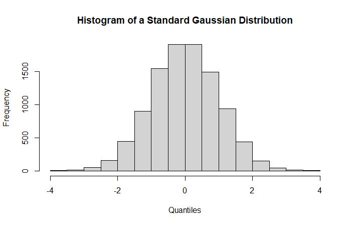
This is our null distribution from which the p-value is based on. The distribution is centered around zero with a unit standard deviation.
In non-statistician terms, the null distribution is a theoretical distribution on which we will compute probabilities to observe our results (Z-Scores).
Now, we are looking at where the Z-Score is located in this distribution in order to obtain evidence against the null hypothesis.
Intuitively, more a Z-Score will be close to zero, more the probability (i.e., p-value) to observe this value will be high. Conversely, a value in the tails of the distribution will involve a small probability. Directly from the Z-Score observed in the previous table we can anticipate a high or low p-value since we know the null value.
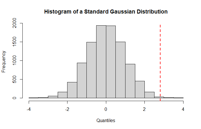
As we can see, the Z-Score for our gene is clearly located in the superior tail of the distribution (red dotted line) suggesting a low probability to observe this result under the null hypothesis. This probability is the famous p-value.
P-value: The probability to observe a result (here the Z-Score) at least as extreme as expected under the null distribution.
Assuming a two-sided test, the associated p-value with a Z-Score of 2.86 is given by the two areas after the red dotted lines in the following histogram.
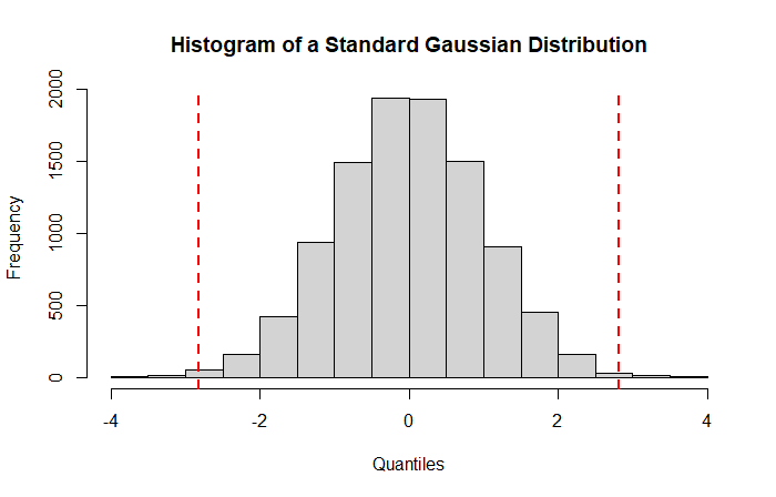
For a two-sided test, larger the areas between the two lines is, smaller your p-value will be, suggesting evidence against the null hypothesis. Indeed, computing the probability to observe at least 2.82 (right red dotted line) and maximally -2.82 (left red dotted line) under a standard normal distribution gives a p-value of 0.004 (2*0.002) as observed in the table. This leads a highly unlikely result under the null hypothesis of no effect of the condition on gene expression,.
Now we are little bit more familiar with the concept of null distribution and p-value, it remains one important question to address: How to determine whether a result is significant ? Indeed, from now, we have talked about evidence against the null hypothesis analyzing probabilities as a continuous element. In practice, however, you will want an arbitrary threshold to discriminate significant to non-significant results. For those familiar with statistics this threshold is the well-known significance threshold.
BUT what implication has my significance threshold on my results ?
The significance threshold as a control of false positives
To be honest, for rigorous people (looking for the truth) the choice of the significance threshold has no satisfactory justification, is just some kind of rule of thumb. To accept a result as unlikely, we can assume an observed result twice standard deviation greater than the expected value. Why not 3 or 4 standard deviations ? This is a legitimate question. In fact, to link the concept of significance threshold with the null distribution observed above, we have to make the opposite path. Instead of computing the probability associated with a Z-Score, we have to compute the quantile associated with a given probability. That is, for any probability we have an associated Z-Score. For example, taking a 0.05 significance threshold, for a two-sided test, the associated quantile is 1.96. Finally, if we have chosen a significance threshold of 0.05 we have decided to considered a Z-Score as significant if its value is greater than 1.96. But the question still remains, what is the impact of the significance threshold on results ?
A more interesting way to see the choice of the significance threshold is its impact on the proportion of false positives. For the beginners, a false positive is a result considered as significant while it is not.
We have seen that most of our results are under the null hypothesis, suggesting that most of our results are non-significant. A 0.05 significant threshold assumes therefore that maximally 5% of the results are false positives. In the entire set of significant results, some will be true positives other false positives, but if all the results are false positives, we will maximally observe 5% of false positives. Similarly, a significance threshold of 0.01 assumes that maximally 1% of the results are false positives.
Under the null hypothesis we expect the proportion of false positives equal to the significance threshold for a method performing well. A smaller observed value is considered as conservative while a greater value liberal. Hopefully, we have graphical tools for helping us in determining whether the model is appropriate.
Two graphical tools for evaluating the correctness of your p-values
In practice, we run a statistical model on our data and we consider results of interest, those with p-values lower our pre-determined significance threshold. But how to be sure that our results are correct ? How to be sure that my results are not mostly false positives ?
To answer this question, in presence of a high number of tests, we have two graphical tools for determining the correctness of our results , the histogram and the quantile-quantile plot, respectively. Both providing complementary interpretation on model adequation to data.
Starting with the histogram, we can expect for a model performing well that the distribution is nearly uniform, meaning that the probability to observe a low p-value is equal to the probability to obtain a high p-value.
In our example we almost observe that with
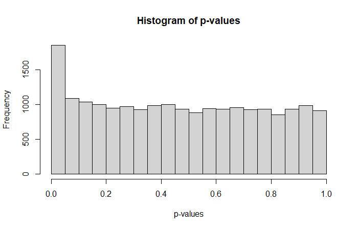
suggesting that we have a slightly higher proportion of small p-values compared to the remaining set.
Where a perfect p-value histogram looks like that
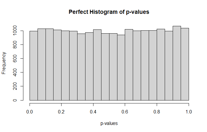
Higher proportions of big p-values suggest a conservative behavior while higher proportions of small p-values a liberal behavior. A conservative model tends to lack of power, while a liberal method provides higher proportions of false positives compared to the expected amount.
Related to my last point, the quantile-quantile plot (qq plot) compared the expected p-value distribution with the observed distribution. For our example we have:
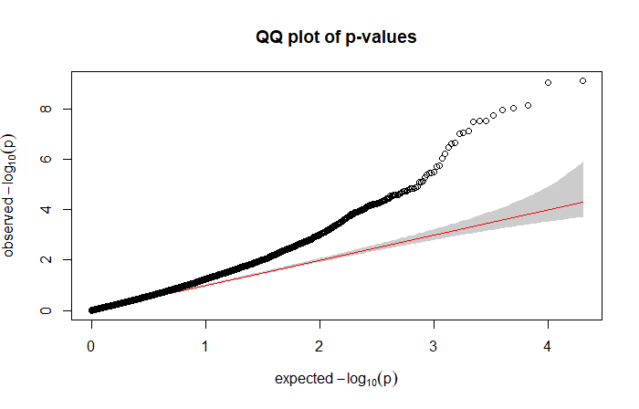
suggesting that the model is too liberal, providing a higher proportion of false positives. Indeed, here we are looking for something like:
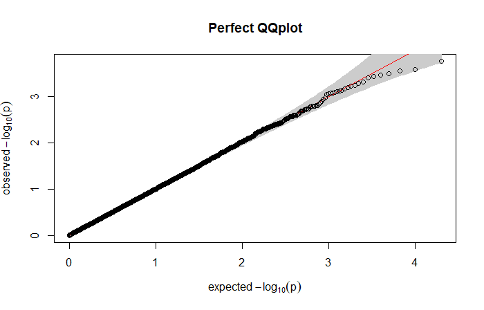
where the points clearly follow the straight line. Similarly of what we obtained with the histogram, points above the line suggest a liberal model (smaller observed p-values than expected) while points below the line a conservative model (bigger observed p-values than expected).
To conclude the model used here is not well-calibrated, increasing the sample size or considering another model should be relevant in order to adequately correct the false positive inflation.
Few words about the correction for multiplicity
In our example of gene expression analysis, we have performed 20,000 models, resulting in 20,000 p-values for which we have to determine whether we have a significant effect of the condition. Considering all results with a p-value lower than 0.05 as significant will unfortunately provide a number of false positives higher than expected. This inflation can be explained by the multiplicity burden of the tests performed. A common approach is to adjust the p-values to take into account the number of tests performed (here 20,000) in order to have the right control of false positives. Traditionally, researchers are faced with two options: the Bonferroni or the Benjamini and Hochberg correction. But, for many this choice is done by default, and I think that understanding the core concepts behind these two procedures is anything but useless.
The Bonferroni correction controls the Family-wise error rate (FWER), which is the probability of rejecting one true null hypothesis, that is, making at least one false positive. The concept is pretty simple, if you have 20,000 different tests, you divide you pre-specified significance threshold by 20,000 and any p-values under this corrected threshold will be considered as significant. In our example, it will give a significant threshold of 2.5e-06 (0.05/20,000), so any gene below 2.5e-06 will be considered significant. Conversely, you can multiply your p-values while using your original pre-specified significance threshold. The Bonferroni correction is known to be conservative in the presence of a high number of tests to be performed, resulting in few significant results after adjustment.
An alternative often used by researchers is the Benjamini and Hochberg (BH) procedure. Instead of controlling the FWER, the BH correction controls the False discovery rate (FDR), which is simply an expected proportion of false positives. The method is a little bit more complex than the Bonferroni correction but provide a more powerful framework resulting to a greater number of significant results.
If we compare the two procedures for the gene expression dataset, the application of the Bonferroni procedure results in 44 significant genes after correction, while BH provides 173 significant genes after adjustment. In other words, if you have thousand of tests, probably using BH should provide an interesting correction for finding significant results while controlling the false positives.
A Brief Summary
In this blog-post I tried to provide core statistical elements to better understand p-values and its underlying concepts. To summarize, here the most important things to keep in mind:
- The concept of p-value is intrinsic of the null distribution
- The null distribution is a theoretical distribution on which we compared our observed results to expected results
- From the null distribution we are able to compute the corresponding p-values which is the probability to observe a result at least as extreme as expected under the null hypothesis
- P-value histogram and qq-plots are useful tools to determine whether a model is well-calibrated for the data
- If we are facing with multiple tests, one can consider to adjust the p-values using either the Bonferroni or the Benjamini and Hochberg correction depending on the research goals.
The R code to replicate the results:
#To ensure result replicability
set.seed(1234)

#Here we simulate synthetic data
data = cbind(replicate(30, MASS::rnegbin(20000, theta=0.1)),
      replicate(30, MASS::rnegbin(20000, theta=0.3)))


#Some code lines for formatting data in order to run the model
colnames(data) = c(paste0("Cond1_rep",1:30), paste0("Cond2_rep",1:30))
rownames(data) = paste0("Gene",1:20000)

data_reshape = reshape2::melt(data)
colnames(data_reshape) = c("Gene","Cond_Rep", "Expression")
data_reshape$Cond = substring(as.character(data_reshape$Cond_Rep), 1, 5)

#We run a negative binomial regression
coef_model_by_gene = list()

for(gene in unique(data_reshape$Gene)){
  #At each iteration we:
  #Subset to only keep the rows corresponding to the gene of interest
  #Fit a negative binomial model
  #Stock the output in the list
  tmp = data_reshape[data_reshape$Gene==gene,]
  model = MASS::glm.nb(Expression~Cond,tmp)
  coef_model_by_gene[[gene]] = summary(model)$coef[2,]
}


#The gene for the table in the blog post
coef_model_by_gene[[20000]]

#The null distribution

null.distribution = rnorm(10000)
hist(null.distribution, xlab="Quantiles", main="Histogram of a Standard Gaussian Distribution")
abline(v=coef_model_by_gene[[20000]][3], lwd=2, lty=2, col="red")

hist(null.distribution, xlab="Quantiles", main="Histogram of a Standard Gaussian Distribution")
abline(v=qnorm(0.025, lower.tail = F), lwd=2, lty=2, col="red")
abline(v=qnorm(0.025, lower.tail = T), lwd=2, lty=2, col="red")

#Model adequation to data
hist(sapply(1:20000, function(x) coef_model_by_gene[[x]][4]), main="Histogram of p-values", xlab="p-values")
gaston::qqplot.pvalues(sapply(1:20000, function(x) coef_model_by_gene[[x]][4]))

#Expected perfect behavior
hist(runif(20000), main="Perfect Histogram of p-values", xlab="p-values")
gaston::qqplot.pvalues(runif(20000), main="Perfect QQplot")


sum(p.adjust(sapply(1:20000, function(x) coef_model_by_gene[[x]][4]), method="bonferroni")<=0.05)
#44
sum(p.adjust(sapply(1:20000, function(x) coef_model_by_gene[[x]][4]), method="BH")<=0.05)
#173

Leave a comment